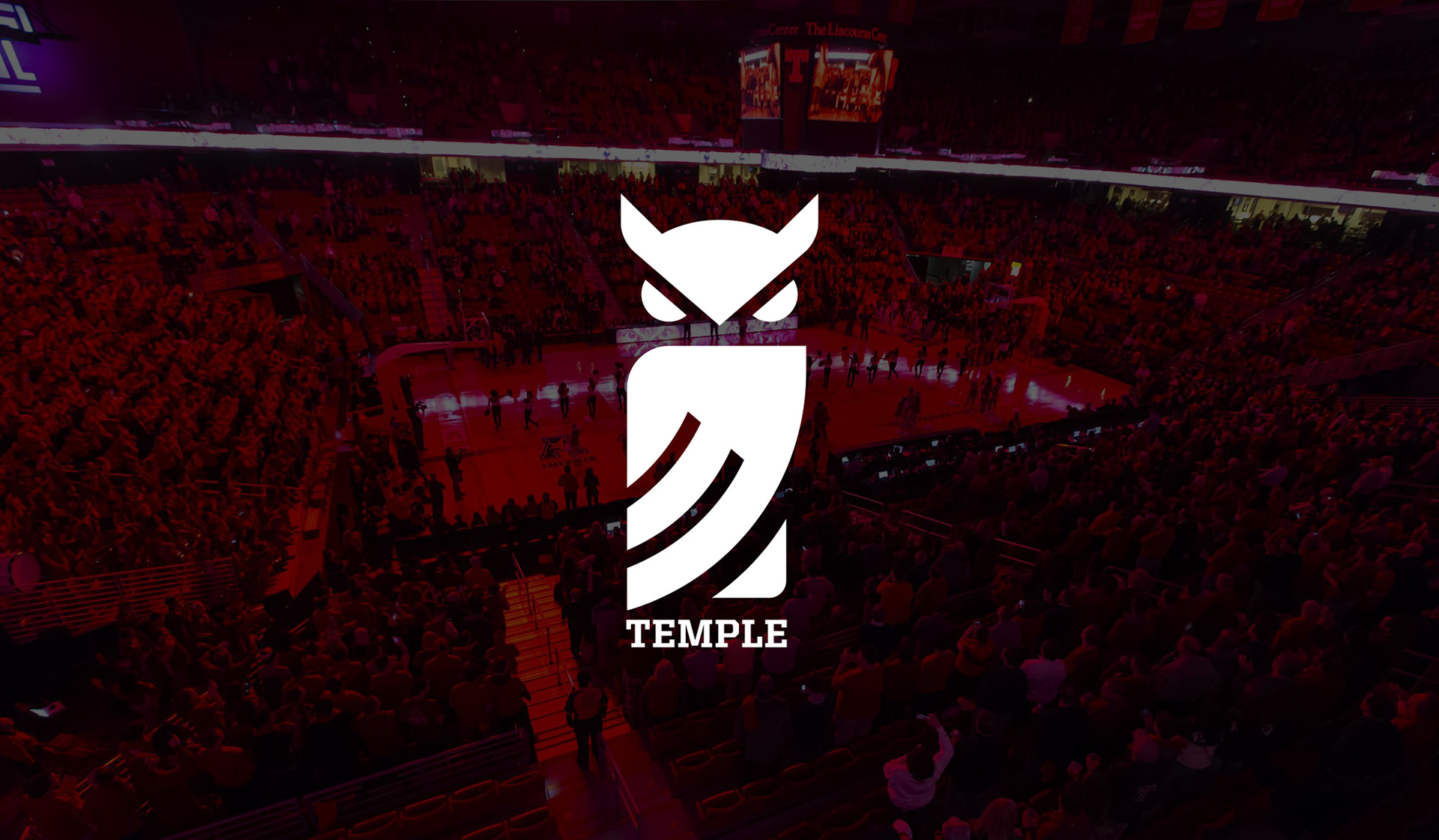
Temple Owls Logo Redesign
Art Direction by Bryan Satalino
Logo Design
Branding
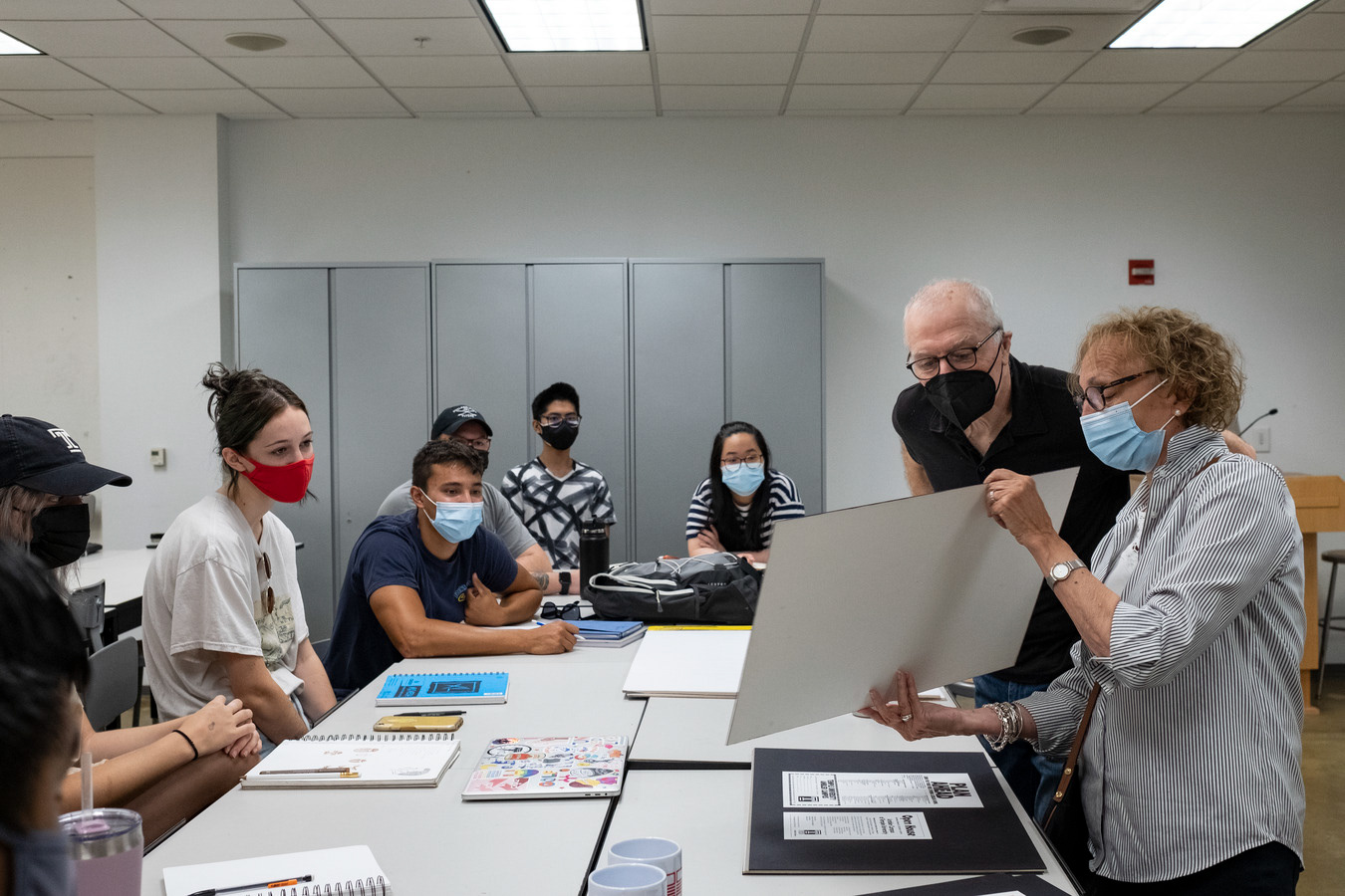
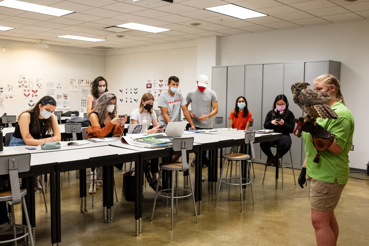
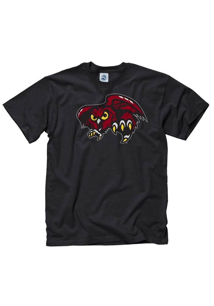
Temple University has long been known for their association with the owl. The owl became the mascot for the school as it was traditionally a night school. Over the years there have been hundreds of different owl designs, and in the late 90’s, Temple employed their “angry owl” logo mark. Over the years it became clear that it needed a redesign. This past semester our class had the opportunity to work alongside Joe Bosack and the Temple Strategic Marketing and Communication group to complete an owl mark redesign for Temple Athletics. While constantly in communication with Joe Bosack & Co. , Temple Athletics, and the Strategic management team we were able to completely redo the look of the Temple Athletics secondary logo. The old logo was very illustrative with many odd colors throughout , our solution was to simplify the logo and stick to two primary colors, red and white. Through weeks of revisions and talk between the Strategic Management team we were able to completely redesign the Temple Athletics logo and give the brand a refreshing look.
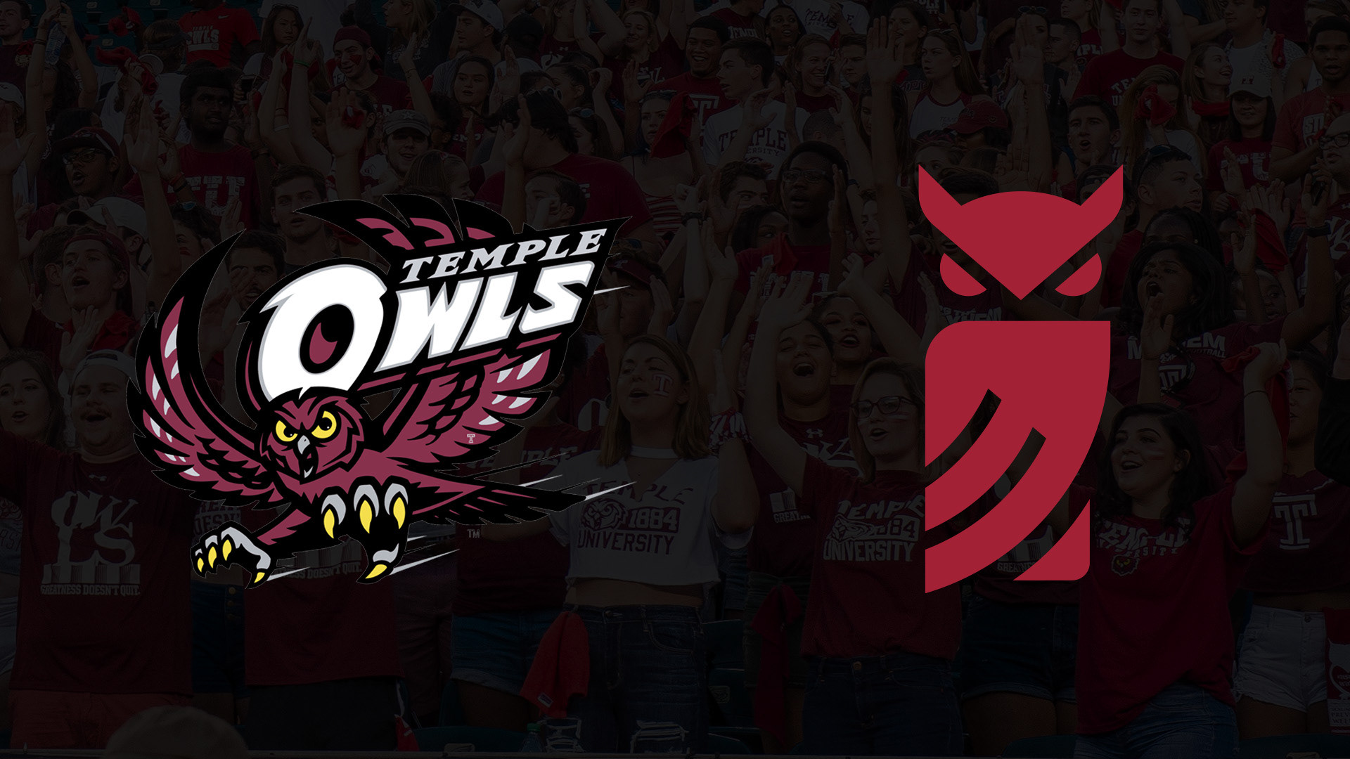
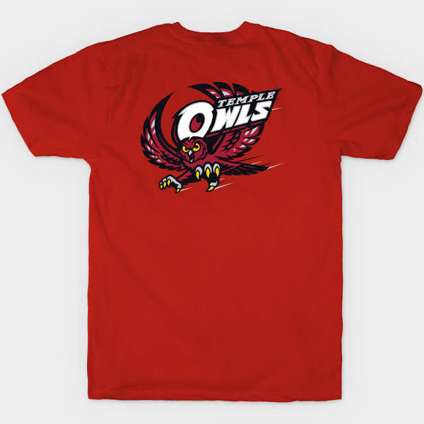
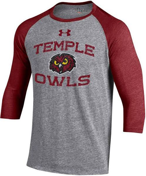
The Original Brand
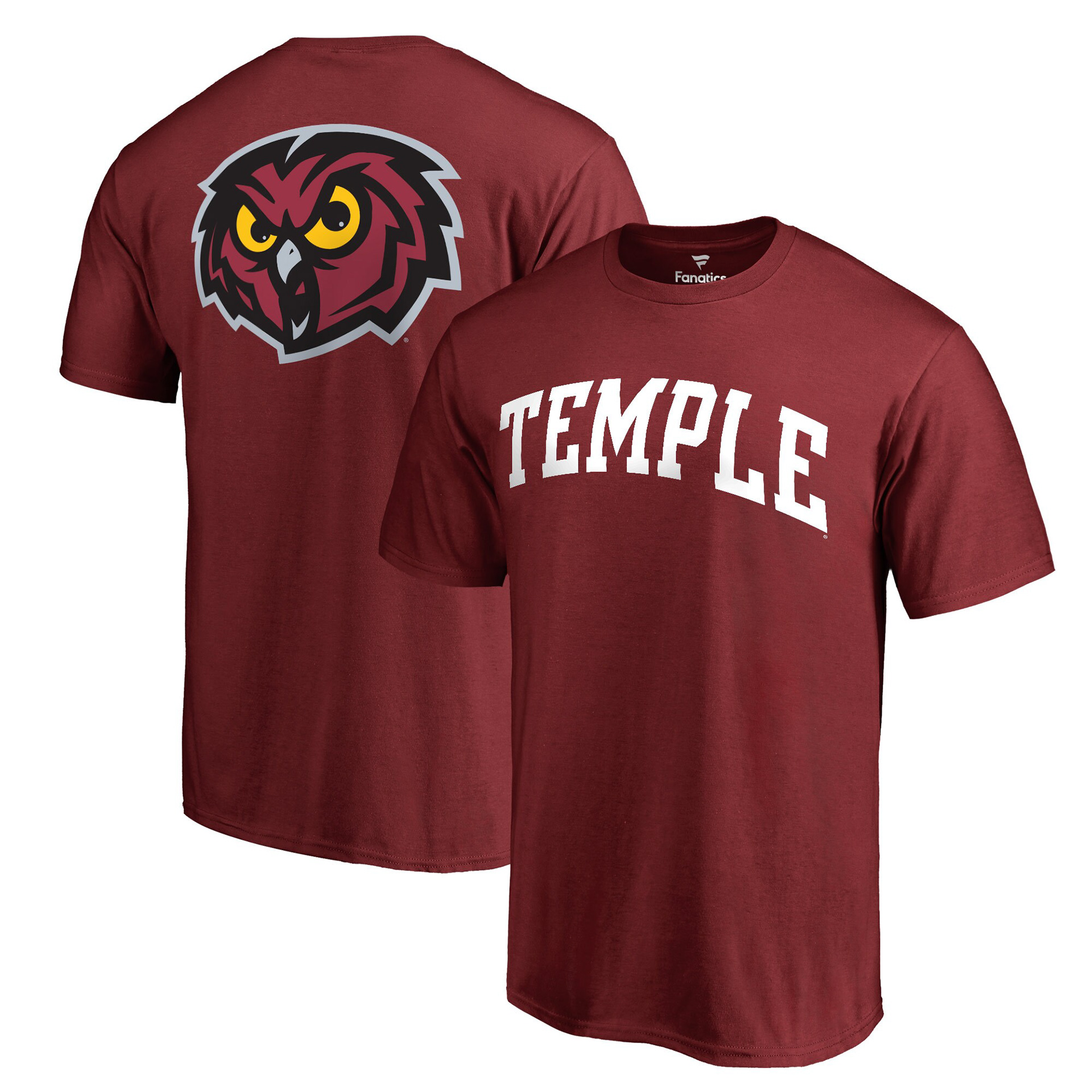
After years of Temple Athletics carrying this logo from jersey to jersey, they felt it was time for a refresher. The design world is constantly evolving with styles and trends and the previous logo was falling behind. Although the logo was tenacious and gritty like all Temple students and Athletes take pride in, Temple Athletics was ready for a new chapter in this legacy. Below are some examples of old merchandise with the Temple Athletics logo. With a very illustrative logo, there were some issues resizing when being put on merchandise and other applications. Since the full logo was unable to work on a small scale, they came out with the head only version. , since the logo was not very responsive, they have created many different versions which is causing the brand to become diluted.
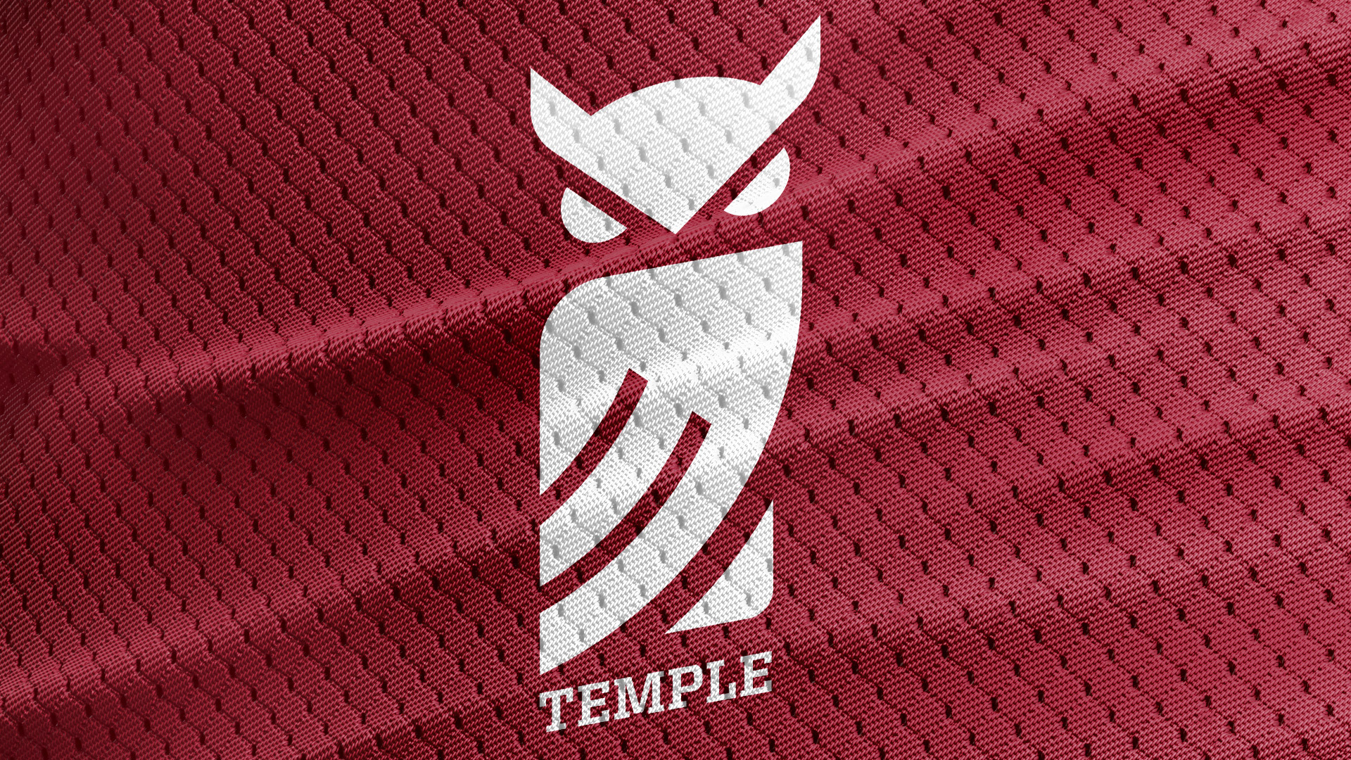
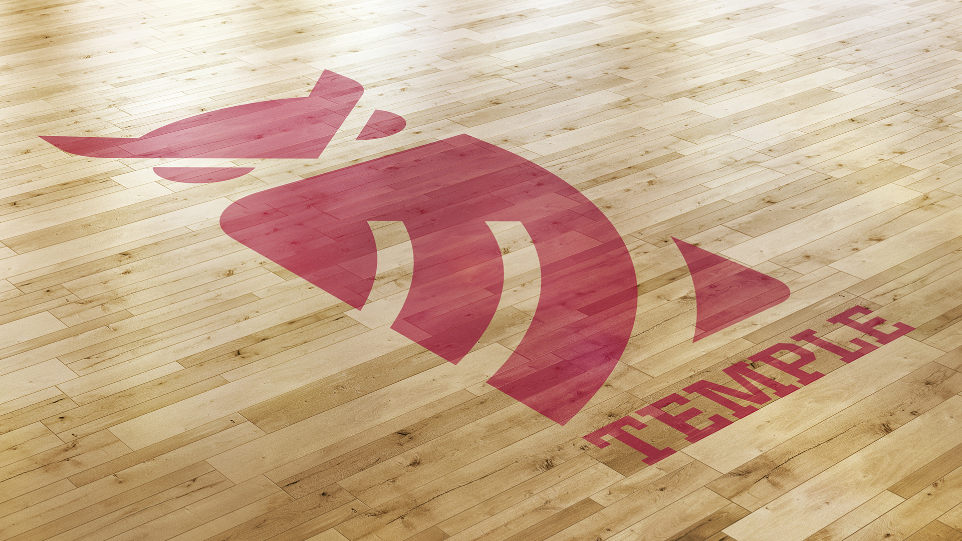
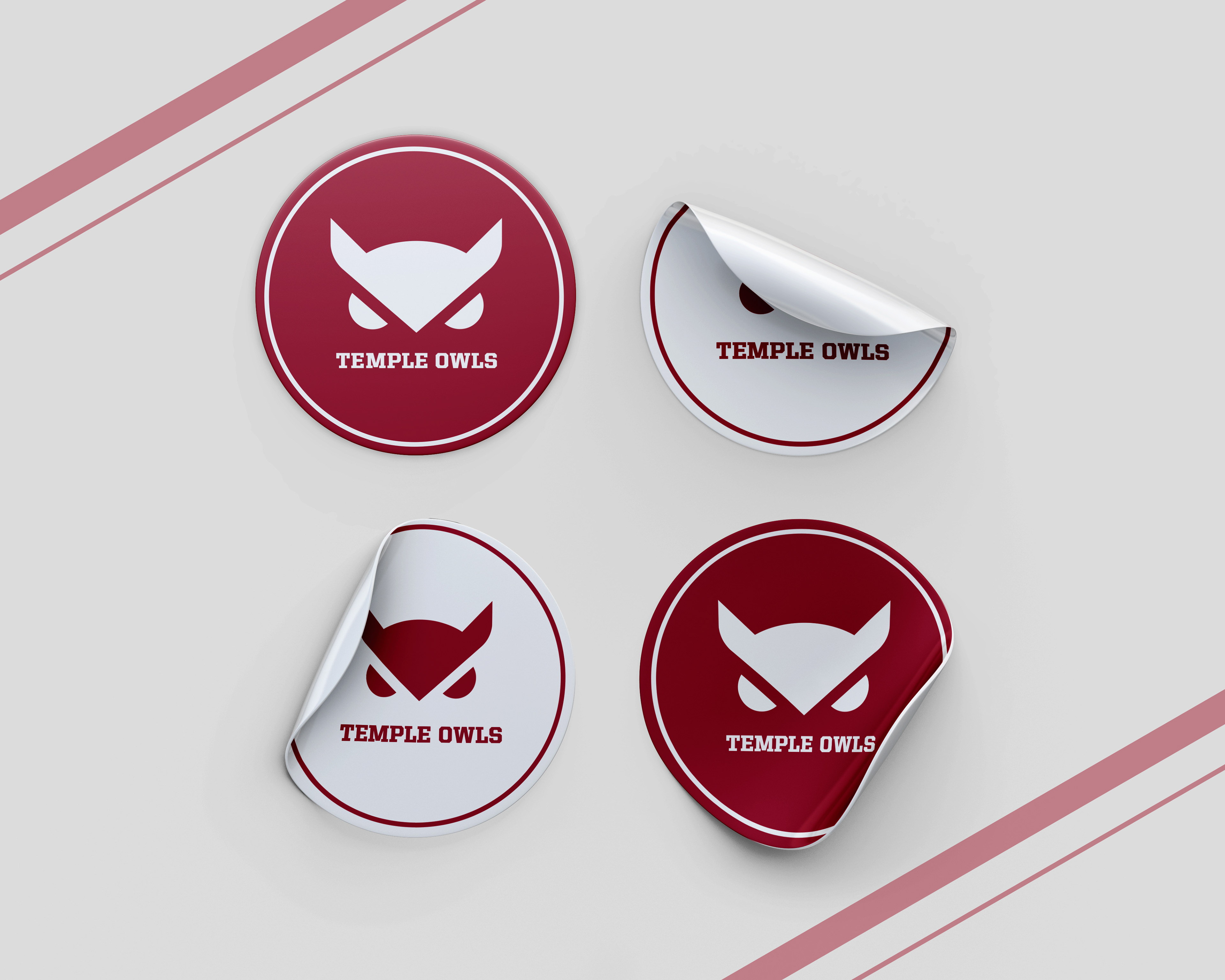
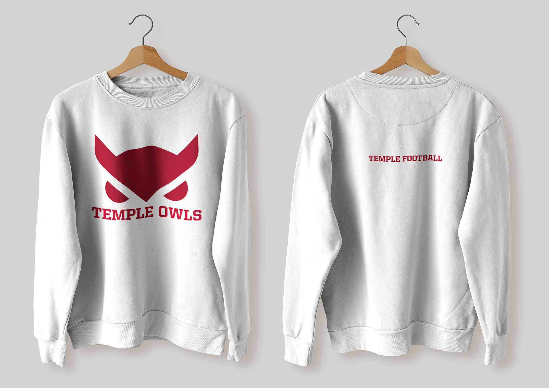
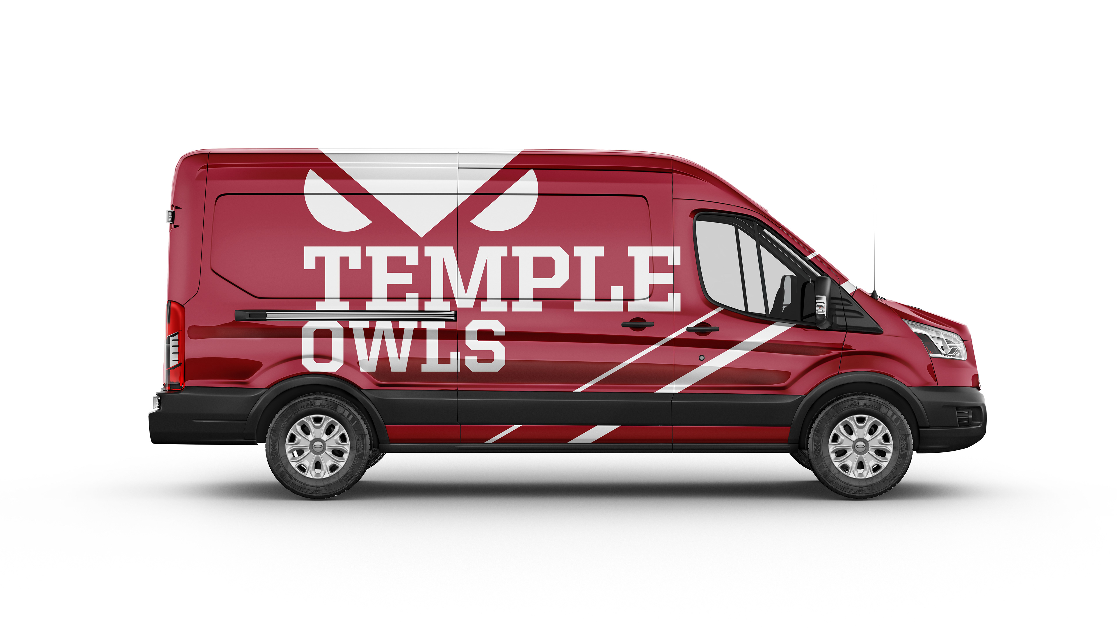
The New Brand
With major changes in the design world, logos are now leaning towards the more simple side as opposed to being illustrative. So, my solution is a much more simple solution. With only one color and no dimension, the logo is so simple it is able to hold its own at any size. The goal was to have the logo be responsive in its full size, as well as have a head only version. Designing a logo that is easily scaleable is important because social media is becoming an essential part of every business. A logo that can well onto a phone screen as well as a big billboard is .